AmbientKnob
AmbientKnob is a rotary control that maps pointer movement to a numeric
value. It is a preset: AmbientRotary supplies the kinematics, and the knob
parts supply the look. Swap either.
Interactive preview
Value: 42
Grounded counterpart
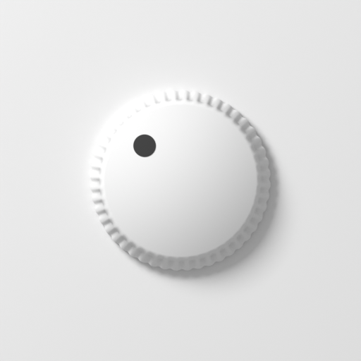
The knob is modeled on its 3D referent (ambient3d/components/knob.py): a
knob-scale body (thickness 2 — the referent's 9mm height) resting on the
panel — a smooth chamfered cap, a knurled rim around it, and an indicator
dot. The rim and the indicator rotate with the value, ribs and all; the cap
does not, because its chamfer is lit from a fixed direction.
Both are machined the way a turned-and-knurled hardware knob is: the ribs
stop short of the top, a bevel carries them out to the full radius, and a
smooth chamfer and the flat cap sit above and inside it. knob.py takes that
as knurl_rim / cap_chamfer, and the two rib sections are the same formula
rather than two shapes fitted to each other — the clip path samples the
referent's wall_r.
Shape
The knob is described by three independent props rather than one variant name: whether the body is ribbed, what is printed on the panel around it, and what the face points with. They compose freely — every combination is a knob someone has built.
knurling
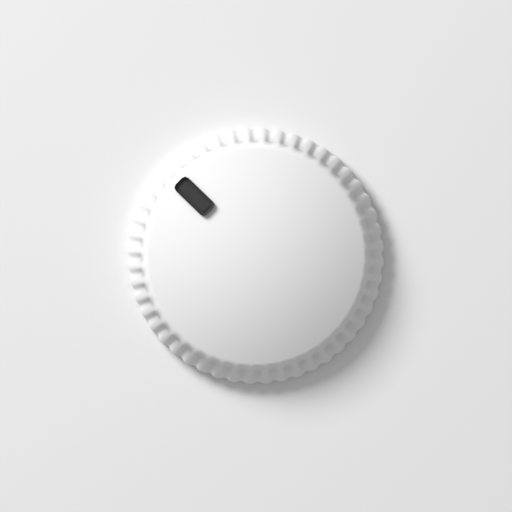
true (default) rings the cap with a 48-rib knurl: the cap sits back by the
band's width and the ribs stand proud of it, clipped to a toothed annulus so
they break the outline and rotate with the value. false gives a smooth
turned body — the cap takes the full width and becomes the whole knob.
Both variants chamfer the cap's edge, the treatment knob.py cuts on every
knob regardless of rib count. A rim of ribs is a grip, not an edge
treatment: it says the knob turns, not where its top face stops.
material applies to both elements a knurled knob paints with, so
material="shiny" is the machined-metal wheel with or without the ribs.
knurlColor
The grip ring's own colour — the one thing the ring may hold apart from the cap, because a dark grip round a pale cap is a real piece of hardware. Any CSS colour, read as an albedo rather than as paint: a dark knurl still takes the scene's exposure, the lamp's cast and the rim's own contact shading, and still goes dark when the lights do.
<AmbientKnob material="brushed-round" knurlColor="#1b1b1e" />
It is set on the ring itself, so it wins over the albedo a micro-relief
material would otherwise put there — the finish keeps its grain and gives up
only its tone. The cap has no matching prop: the cap's colour is the control's
colour, set the ordinary way with --amb-albedo.
AmbientRotary still has no material prop and this preset does: how many
elements a material has to reach is a fact about this knob's construction,
and a mechanism cannot know it once the parts are yours.
markers
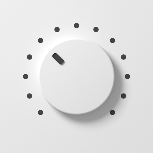
Printed scale dots on the panel around the knob, on the same arc the value
sweeps — so a dot always sits where its value points, at any travel. They do not
rotate, because they are panel graphics rather than part of the control, and
they take --amb-label (the legend ink) rather than the accent colour.
none(default) — bare panel.ends— the two dots the travel starts and stops at. They sit at 0.94 of the radius, so only their outer edge clears the knob's own footprint and no clearance is reserved.full— 13 dots evenly spaced across the sweep. The ring reaches past the knob, so the component reserves that clearance — on all four sides, not just the three the arc needs, so the knob stays concentric with the box it occupies rather than shifting down off the point you positioned it on. The label clears the ring too, so it sits further from a knob with a full ring than from a bare one.
indicator
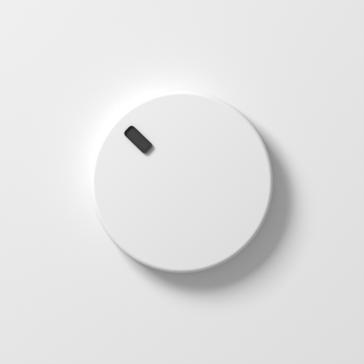
circle(default) — the grounded referent's offset dot.rectangle— a short radial bar out near the rim, running 0.50 to 0.84 of the radius.
Props
| Prop | Type | Default |
|---|---|---|
value | number | - |
min | number | 0 |
max | number | 100 |
step | number | 1 |
label | string | - |
knurling | boolean | true |
knurlColor | string (any CSS colour) | - |
markers | "none" | "ends" | "full" | "none" |
indicator | "rectangle" | "circle" | "circle" |
material | "matte" | "shiny" | "glass" | "brushed" | "brushed-round" | "blasted" | - |
size | "sm" | "md" | "lg" | "md" |
travel | number | { start, sweep } | 270 |
input | "drag" | "angle" | "delta" | "drag" |
animate | "auto" | "follow" | "ease" | "snap" | "auto" |
detents | number | from step |
dragDistance | number | 200 |
wrap | boolean | false |
defaultValue | number | min |
onChange | (nextValue: number) => void | - |
Also accepts standard HTMLAttributes<HTMLDivElement> (except native onChange).
Travel and pointer mapping
travel
How far the knob turns, in degrees clockwise from 12 o'clock. A bare number
is a sweep centred on 12 o'clock, so 270 (the default) is the usual
8-to-4 pot and travel={240} is a narrower one. For an off-centre sweep,
pass { start, sweep }.
Markers read the same sweep, so a dot always lands where its value points
whatever you set here — ScaleRing takes the angles off the control rather
than restating them.
input
Three genuinely different mappings, not one with a parameter:
drag(default) — pointer distance becomes a value delta. Drag up to increase, down to decrease; hold Shift for a quarter-speed fine mode.dragDistanceis the pixels of travel for the full range. This works at any sweep and is the only mapping that behaves on touch, where a finger covers the knob it is turning.angle— pointer position becomes an absolute angle, so the knob jumps to wherever you press. Needs a sweep under a full turn. Past the ends of the travel the value holds at whichever end is nearer.delta— accumulated angular change, with no ends at all. This is the endless-encoder mapping; pair it withwrapto run pastmaxand come round again.
At travel={360} or wider, angle is ambiguous — the first and last values
share a screen position — so it is rejected with a warning and falls back to
drag.
step, detents and animate
Three independent things that look like one:
stepquantises the value.0leaves it continuous.detentsquantises the travel — how many rest positions the knob has. It defaults to the step grid, but an endless encoder can have 24 detents per turn with a continuous value.animatesays how the face moves to a new position:follow(1:1 with the pointer, no transition),ease, orsnap. The default,auto, follows while you drag and eases otherwise.
Building your own
AmbientKnob is AmbientRotary plus a set of parts. Replace any of them —
the parts are ordinary markup, and yours stand on exactly the same footing
as the built-ins.
import { AmbientRotary, KnobBody, ScaleRing, useControlState } from "@ambientcss/components";

function Wedge() {
  const { percent } = useControlState();
  return <span className="my-wedge" style={{ opacity: 0.4 + percent * 0.6 }} />;
}

<AmbientRotary
  value={gain}
  onChange={setGain}
  className="amb-knob"
  label="Drive"
  parts={{
    panel: <ScaleRing count={7} />,
    base: <KnobBody flush material="shiny" />,
    actuator: <Wedge />,
  }}
/>
Parts go into four frames, painted in this order:
| Frame | What it does |
|---|---|
panel | static, behind the control, allowed to overflow its box |
base | static, the control's own footprint |
actuator | rotates to --ambx-angle — the moving part |
fixture | static, above the actuator |
A part needs no state plumbing to react to the value: the control publishes
--ambx-percent, --ambx-angle, --ambx-size and the rest on its own
root, so a part can be pure CSS. useControlState() is the same data as
JS, for parts that have to count something.
Want the body to stay still while a printed pointer sweeps? Put everything
in base, leave actuator empty, and read --ambx-angle yourself.
Example
import { useState } from "react";

function GainKnob() {
  const [gain, setGain] = useState(45);

  return (
    <AmbientKnob
      label="Gain"
      value={gain}
      min={0}
      max={100}
      step={1}
      onChange={setGain}
    />
  );
}
Behavior notes
- Value is clamped to
[min, max]and snapped usingstep. - Arrow keys step by
step, Page keys by ten of it, Home/End go to the ends. - Pass
valuefor a controlled knob ordefaultValuefor an uncontrolled one;onChangefires either way.