AmbientButton
AmbientButton wraps a native <button> with ambient styling.
Interactive preview
Triggered: 0
Grounded counterpart
The button is modeled on its 3D referent (ambient3d/components/button.py):
a chamfered key cap seated in a clearance well, the well's gap ring showing
around it. Pressing sinks the cap by the referent's 0.7mm travel — the
chamfer bands and the swept shadow shrink with it.
The cap top is dished, not flat: the far wall of the scoop tilts into
the light and the near wall tilts away, so the face darkens just past the
lit edge and brightens toward the far one. It reads
--amb-curve-delta,
the same measured curvature amb-surface-concave rides, and all three cap
silhouettes get it equally — a dish belongs to the tooling, not to the
outline. Deepen or flatten it with --amb-curve-scale, on one button or a
whole panel.
Pressing changes nothing about the cap's colour. It only sinks the cap
by the referent's 0.7mm travel (thickness 1 to 0.84, 0.8 to 0.64
for the square pad): the swept drop shadow shortens as the silhouette drops
toward the well floor, and the chamfer bands narrow with it. The press reads
as travel rather than as a state repaint.
Shapes
Cap silhouettes from the referent lineup (ambient3d/generate.py):
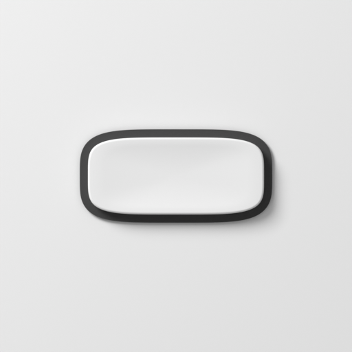
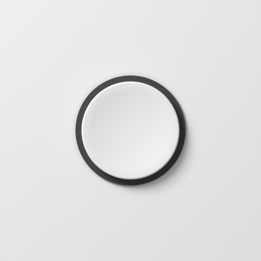
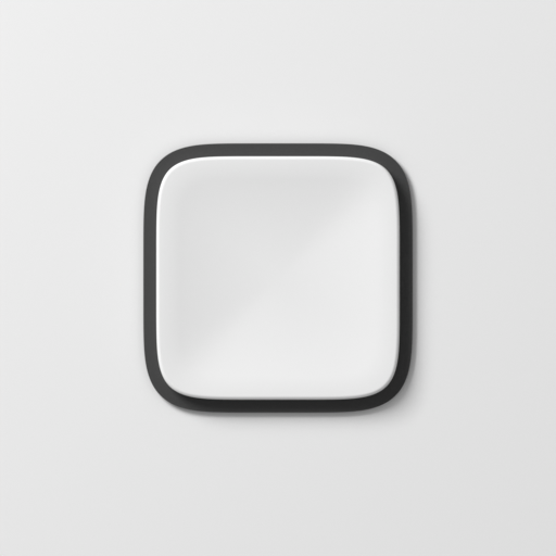
pill(default) — the wide stadium transport key.round— a circular key (superellipse exponent 2). Pair withmaterial="shiny"for the machined metal-button look.square— a squarer, flatter pad (exponent 6): tighter corners and a 3.6mm cap instead of the key's 4.5mm, with the same 0.7mm press travel.
Grounded shape counterparts
Sizes
size="sm" | "md" | "lg" scales min-width, cap padding, and label size per
shape — "md" is the unchanged default. See the full per-shape table in
Design tokens.
Props
| Prop | Type | Default |
|---|---|---|
shape | "pill" | "round" | "square" | "pill" |
material | "matte" | "shiny" | "glass" | "brushed" | "brushed-round" | "blasted" | "matte" |
size | "sm" | "md" | "lg" | "md" |
mode | "momentary" | "toggle" | "repeat" | "momentary" |
onPress | () => void | - |
value | boolean | - |
defaultValue | boolean | false |
onChange | (on: boolean) => void | - |
repeatDelay | number | 400 |
repeatInterval | number | 60 |
Micro-relief materials
brushed, brushed-round and blasted paint their grain into both of an
element's pseudo-elements, and the cap already spends its own ::after on
the dish. So the cap gives them an inner layer instead — you get the finish,
the cap keeps its dish, and nothing about the markup you write changes.
None of the three carries a colour of its own (@ambientcss/css), so a cap
you leave uncoloured renders at the reference ground, same as matte or
shiny would. Colour one with --amb-albedo the ordinary way and the
dish's own shading follows it automatically, through --amb-shade — there
is no separate tone to set for the cap. One thing that does not follow
automatically: on a cap coloured dark enough, the stock legend colour can
disappear into it, the same way it would on a dark matte or shiny cap —
set --amb-label yourself if that happens.
Also inherits all ButtonHTMLAttributes<HTMLButtonElement> props.
mode
A transport key, a latching mute and an auto-repeating nudge button are the same object with three state machines and identical paint.
momentary(default) — firesonPress(andonClick) on activation.toggle— stays pressed in. Drive it withvalue/onChangeor leave it uncontrolled withdefaultValue; it reportsaria-pressed.repeat— firesonPresson the press, then repeatedly while held, afterrepeatDelayand everyrepeatIntervalthereafter.
<AmbientButton mode="toggle" value={muted} onChange={setMuted}>Mute</AmbientButton>
<AmbientButton mode="repeat" onPress={() => setBpm((n) => n + 1)}>+</AmbientButton>
AmbientButton is a preset over AmbientPress. For a key that looks like
yours, give the mechanism your own cap — see
Composing controls.
Examples
Basic
<AmbientButton>Play</AmbientButton>
Disabled
<AmbientButton disabled>Bypass</AmbientButton>
Custom click handler
<AmbientButton onClick={() => console.log("trigger")}>Trigger</AmbientButton>
Default class stack
A button is two elements: the well (the <button> itself) and the cap seated
in it. The mechanism puts the control and size classes on the root, and the
kit adds its own look class; the cap is a part, so its classes come from the
kit too.
| Element | Classes |
|---|---|
| well (root) | ambx-control ambx-press ambx-press-md amb-button amb-groove |
| cap | amb-button-cap ambient amb-chamfer amb-surface amb-heading-3 amb-mat-matte |
ambx-press-md follows size, amb-mat-matte follows material, and
shape adds amb-button-round or amb-button-square to the root. The size
class is what carries --ambx-button-size and the cap padding, so markup
that copies this stack by hand — a link styled as a key, say — has to carry
an ambx-press-* class or the cap collapses to its text.